This help article describes how to use plot building tool.
Paste your data into the text area, choose file name where data will be saved to, choose column delimiter and optionally figure caption. Click Done and Papeeria will add data file into the project, compile PDF file with a histogram and insert figure tags at the caret position.
European Central Bank web site
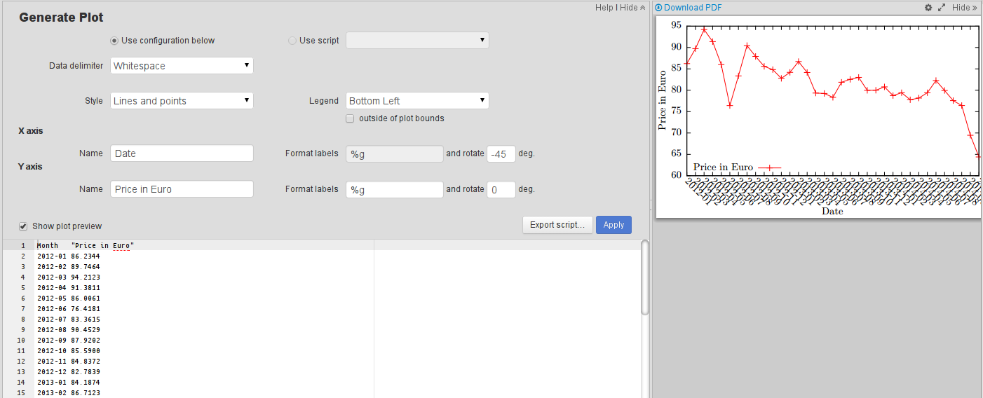
Let's build a graph of oil price changes and tune it a little bit. Quick plot created with Insert Plot action looks as shown below. We want to make X tic labels less dense, change colors and line style a little bit and add a dashed line at the mean value of oil prices.
So let's start with exporting our plot to gnuplot script. Click Export script button, choose script file name (it is important keep .gnuplot extension) and location and leave Use as input checkbox switched on to feed your data to the generated script. Open the generated .gnuplot file in the editor and paste the following code. We hope comments in the code are explanatory enough.
Now we can go back to our text and compile it. Figures are already there, we may need to adjust their placement using optional argument of the figure environment and enjoy the result.
We plan to enhance plot builder capabilities and add other plotting systems. Don't hesitate to file tickets to our bug tracker or uservoice!
On Google+: http://google.com/+Papeeria
and VKontakte: http://vk.com/papeeria
Scenario
Suppose you've got some data and you want to build a histogram and insert it into your paper. Let's take oil production stats as an exampleCountry "Production (mln bbl/day)"" "Share of World \\%" "Saudi Arabia" 11.7 13.80 "United States" 11.1 13.09 Russia 10.3 12.23 China 4.3 5.15 Canada 3.8 4.54 Iran 3.5 4.14 Iraq 3.4 3.75 "United Arab Emirates" 3.08 3.32 Venezuela 3.02 3.56 Mexico 2.9 3.56Oil production data taken from Wikipedia
Adding a plot
Adding a plot into LaTeX document involves a few steps: one needs to create a plot itself and then insert a plot into the text as a figure. In Papeeria you can do all this stuff quickly: place caret where you want to add figure tags, hit Alt+Insert and choose Insert Plot from the context menu.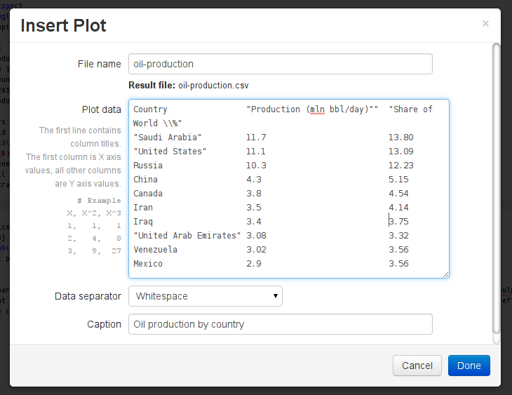 |
| Insert Plot dialog |
Paste your data into the text area, choose file name where data will be saved to, choose column delimiter and optionally figure caption. Click Done and Papeeria will add data file into the project, compile PDF file with a histogram and insert figure tags at the caret position.
Hint: choose column delimiter appropriately and quote values which contain delimiter substring (especially important when delimiter is whitespace)
Month   "Price in Euro"
2012-01 86.2344
2012-02 89.7464
2012-03 94.2123
2012-04 91.3811
2012-05 86.0061
2012-06 76.4181
2012-07 83.3615
2012-08 90.4529
2012-09 87.9202
2012-10 85.5900
2012-11 84.8372
2012-12 82.7839
2013-01 84.1874
2013-02 86.7123
2013-03 84.1555
2013-04 79.3453
2013-05 79.2452
2013-06 78.3375
2013-07 81.8711
2013-08 82.5541
2013-09 83.0109
2013-10 79.9776
2013-11 80.0078
2013-12 80.7921
2014-01 78.7576
2014-02 79.4208
2014-03 77.7698
2014-04 78.1769
2014-05 79.4203
2014-06 82.2801
2014-07 79.9469
2014-08 77.5741
2014-09 76.4254
2014-10 69.4637
2014-11 64.3892
Oil price data from
European Central Bank web site
Live preview
When data file is opened in the editor, it is possible to preview the compiled plot by ticking "Show plot preview" checkbox. We refresh plot in the preview as you type. If it fails to compile because of error in data or some other reason, we show a cached plot.Plot settings
Cogs icon above the editor with opened data file provides access to plot settings pane. You can change plot style, data columns delimiter, position legend appropriately, define axis names, change ticks format and rotation. Most of the options are quite simple, with tics label format being the most tricky. Please refer to gnuplot docs to learn about format specifiers. At the moment we take tic labels for X axis from the first column in the data file.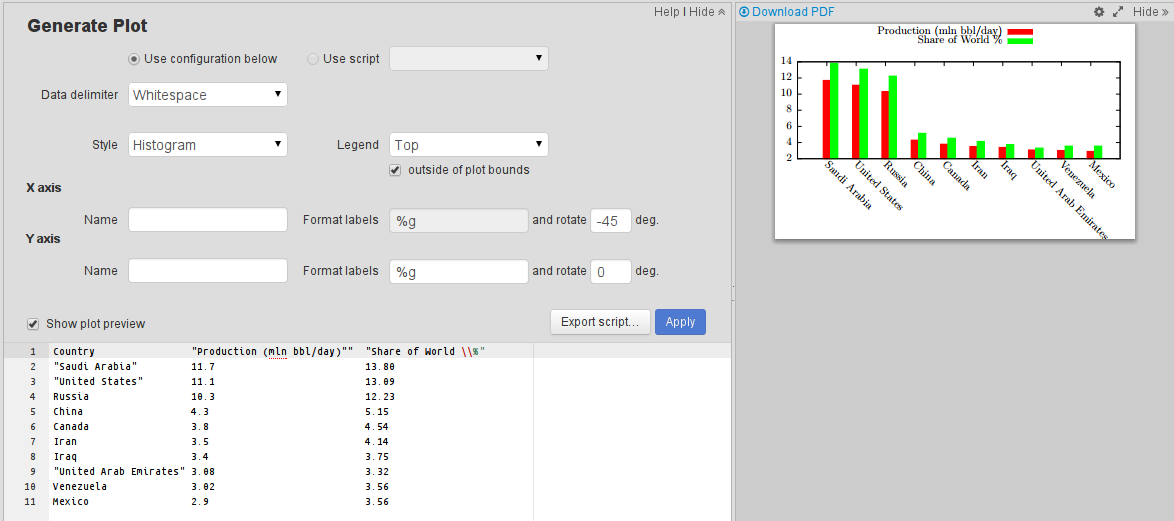 |
| Plot settings pane and live preview |
Advanced plotting
Behind the scenes we compile plots with gnuplot and xelatex. Users of free Epsilon plan don't have many tuning options, however, customers who are subscribed to paid plan Delta have access to raw gnuplot scripts and can enjoy almost all gnuplot features.Let's build a graph of oil price changes and tune it a little bit. Quick plot created with Insert Plot action looks as shown below. We want to make X tic labels less dense, change colors and line style a little bit and add a dashed line at the mean value of oil prices.
 |
| Initial oil prices plot |
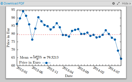
So let's start with exporting our plot to gnuplot script. Click Export script button, choose script file name (it is important keep .gnuplot extension) and location and leave Use as input checkbox switched on to feed your data to the generated script. Open the generated .gnuplot file in the editor and paste the following code. We hope comments in the code are explanatory enough.
# Code generated by the plot builder
set datafile separator whitespace
set key autotitles columnhead bottom left
set style data linespoints
set style fill solid 1.0
set format x "%g"
set xtics rotate by -30
set format y "%g"
set ytics rotate by 0
set xlabel "Date"
set ylabel "Price in Eur"

# Calculating mean value using constant fitting function
f(x) = mean_y

# '<&3' takes input from the file with descriptor number 3.
# If you checked "Use as input" checkbox when you
# generated a script then your data file will be associated with this descriptor.
# If you have another data file in your project and want to use it here,
# you may just use relative file name
fit f(x) '<&3' u 0:2 via mean_y

# Placing label on the plot. Yes, you can use LaTeX!
set label 3 gprintf("Mean =$\\frac{\\Sigma_i price_i}{N} = %g$", mean_y) at 1, 65

# required to enable dashed line types
set termoption dash

# blue-ish solid with width 2 and small round shaped dots
set style line 1 linecolor rgb '#0060ad' linetype 1 linewidth 2 pointtype 7 pointsize 1

# keywords can be abbreviated:
# red-ish dashed width 2, dots undefined
set style line 2 lc rgb '#dd181f' lt 2 lw 2

# this function returns non-empty string with the value of column number "labelcol"
# for every fifth value of column countcol (0 is the column with ordinal numbers of
# the rows in the dataset)
everyfifth(numcol, labelcol) = (int(column(numcol)) % 5 == 0) ? stringcolumn(labelcol) : ""

# Plot our data using line style 1 (defined above) and mean function
# using line style 2
plot '<&3' using 0:2:xtic(everyfifth(0, 1)) ls 1, f(x) ls 2
 |
| Oil prices plot after tuning |
Now we can go back to our text and compile it. Figures are already there, we may need to adjust their placement using optional argument of the figure environment and enjoy the result.
LaTeX in plot labels
Plot labels are compiled with xelatex, so you can use maths and other LaTeX features.Hint: you need to double-escape with backslash symbols which carry special meaning to LaTeX, such as percent symbol (see the first data sample above)
Connecting data files and script files
You may want to create different scripts and choose which one to use to process your data file in the plot settings pane. You can also link a few data files to the same script, and they will recompile automatically when you change the script file.Help on gnuplot
Admittedly gnuplot is not the easiest plotting system. If there is an issue with your script and gnuplot writes something to the log, we'll show it in the log pane. However, sometimes log records may not be very helpful. If you're struggling with gnuplot scripts, here is a short list of useful links:- Official gnuplot documentation
- Gnuplot tag on StackOverflow
- Excellent blog gnuplotting.org with good posts authored by Hagen Wierstorf
- Impossible gnuplot graphs page by Zoltán Vörös
Known limitations and future work
At the moment being plots don't play well with project versions and project clones. We are working on this and will fix the issues shortly.We plan to enhance plot builder capabilities and add other plotting systems. Don't hesitate to file tickets to our bug tracker or uservoice!
Want to stay in touch?
Follow us on Twitter: http://twitter.com/PapeeriaOn Google+: http://google.com/+Papeeria
and VKontakte: http://vk.com/papeeria